An explanation
As mentioned in my previous post, I really wanted to optimize my hexo blog for speed. I’ve started a new project and decided hexo would be a good fit for it. Since I’ve grown used to hexo, it will make development faster. Albeit it’s not a blog I’m working on, but a webpage for a local blacksmith. That will involve quite a few images and just a few text entries/pages. Being able to deploy to S3 is also a benefit - no need to manage anything - and since the webpage is going to be pretty static I’m thinking hexo is a good way to go. The problem though, is that most of the themes that hexo has are quite slow out of the box. For this walkthrough, I’ll be doing a demo repo with a standard hexo init followed by a clone of the theme edinburgh. I have a repo setup with all the steps tagged, so you should be able to see the exact changes I’m making. I’ll include step links just after the heading for each section if you’re interested in following along. Let’s get going then.
Prologue
I’ve created a new hexo project, did a couple minor template adjustments and hexo config changes and added 3 test posts to the blog. With that, I should be golden to test the blog out with PageSpeed Insights. Here’s the sad reality:
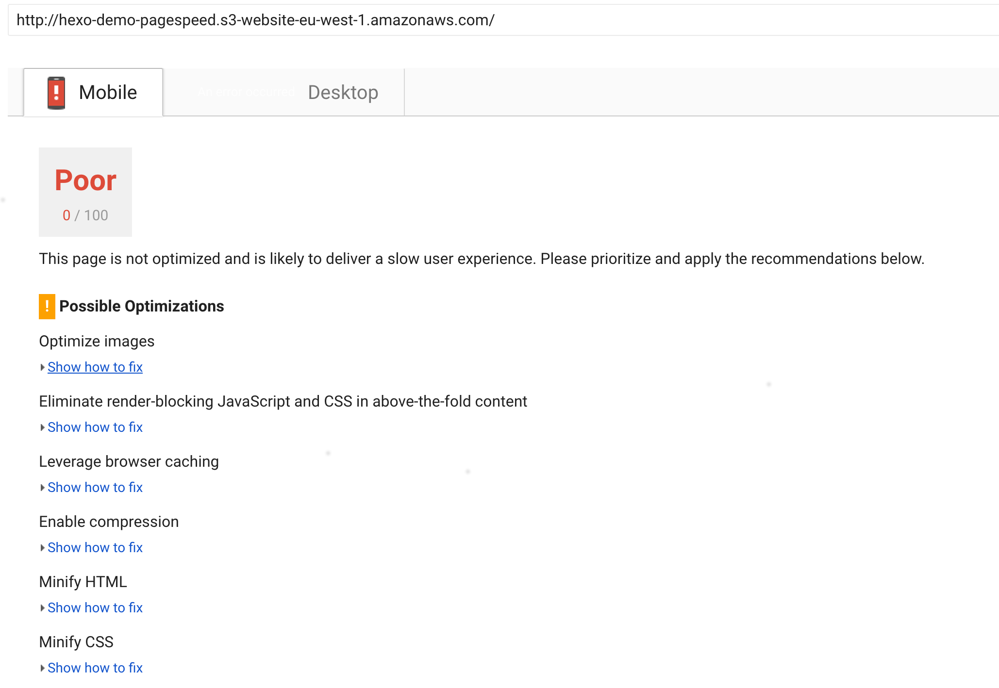
The desktop version refused to even be analyzed.
Take note that all the page speed analysis was done on the index page, the individual pages are not being analyzed here.
To be completely honest, it is the first time I’ve seen such bad results in PageSpeed Insights and for a good reason. The posts I’ve added contain images that are huge: 3000x2000, 5100x3088, 6000x4000 and 4476x2984 pixels. At the largest, the image I’ll ever serve is shown inside the blog post and if I open that I can see that at a resolution of 1920 x 1080 the images will top out width-wise at 1854 pixels. That is the reasonable maximum I’d go with. Any pixel above that is a wasted pixel. I know that this page won’t need the images to be as big as they are now or even reach the 1854px mark. I’ll usually be displaying images way smaller than that. Besides, the images are not optimized in any way shape of form, let’s fix it.
Image optimization
Now this took me on a bit of an adventure. I do some digging through hexo plugins but find nothing that would suit my needs(if you know of one, please let me know). Time to code a plugin for hexo I suppose. Now, I’m no expert in image manipulations so I do some research on how to do it and come across imagemagick. I dig through the internet and find this article on image manipulation via imagemagick. I’ll go with this, for now. Since I’ve never coded a hexo plugin and haven’t coded proper node for at least half a year I look through the source code of some of the libraries I mentioned before. It seems that hexo is easily extendable so I decide on making a plugin that will go through the public directory after hexo generates the files, pick out all the .png/.jpg/.jpeg files and apply imagemagick’s convert function on top of that with given params which you’d specify in the _config.yml. I was rather new to all this, so it probably took longer than expected but I made a plugin and named it rather stupidly hexo-img-optimization(I already regret that but naming is hard). It adds a command to hexo, hexo img, that will read your _config.yml, look for img_optimization there and act according to its settings. If not found, it will default to going through png/jpg/jpeg files and resize them to what I consider a good amount of pixels for a landscape image in a 1080p screen while lowering the quality a bit. The drop in quality is barely noticeable. You can play around with the imagemagick params to figure out a configuration that would work on your hexo blog. If, however, you’re not using hexo there are plenty of alternatives that can optimize your images for you, such as compressor.io or kraken.io. For my purposes, overriding the defaults for hexo-img-optimization with -resize 900x800^> -sampling-factor 4:2:0 -strip -quality 85 -interlace JPEG -colorspace RGB seems to do the trick and cross all of my boxes. With this, the PageSpeed Insights score looks as follows:
| Score | |
|---|---|
| Mobile | 69 |
| Desktop | 55 |
That’s a much better score.
Minification
Time to search for plugins again. I find this hexo-all-minifier. It seems to tick all the checkboxes. Minifies css/html/js and even images(albeit it only optimizes them, without resizing). Nice. The minifier runs once we run hexo generate. I regenerate the files and deploy them to s3. Once done I rerun the page speed insights.
What this does is actually remove the Minify CSS, Minify HTML and Minify JavaScript optimizations from the possible list in page speed insights but the page score does not improve:
| Score | |
|---|---|
| Mobile | 69 |
| Desktop | 55 |
That’s due to the fact that most of our css and js is external, hence the files we minified only comprise a small part of our total payload on page load. For themes that are more heavy on their own css and js the change will be noticeable.
Compression
Time to tick the compression checkmark. hexo-command-gzip is a plugin that gzips everything in the public folder, which is what I’m going for. The problem here is that I’ve hosted this page on AWS S3. When I upload the gzipped files to AWS S3 and open the page - my browser does not know that the contents are gzipped. To fix it, I need to attach a gzip header to all the files I upload to s3. hexo-deployer-s3 provides functionality to add headers to uploaded files. I do not like it though, since it applies the same header to all the filetypes. I have since forked the repo and made the changes to allow for different headers for different filetypes. It already comes with the repo I’ve added in this walkthrough, but here’s a link if you need it. We’ll not use the different filetype functionality for now, but it will come in handy later. After adding the required config part(it’s here) I deploy and test again:
| Score | |
|---|---|
| Mobile | 70 |
| Desktop | 55 |
Once again, due to small number of internal css and js the change is barely noticeable.
Thumbnails
The page is heavy on the image side, therefore most of the gains will be made here. Since we’re displaying quite a few different image sizes depending on the page you’re on or the device screen size, it’s best to generate thumbnails and use them. I have since added support for thumbnails to hexo-img-optimization. This will require few changes to the template and a config change, but with those in place I expect the page speed to be much much better. After deploying, these are the results:
| Score | |
|---|---|
| Mobile | 70 |
| Desktop | 87 |
Now that’s a score I could live with. But I won’t. The issues left are caching, and render-blocking css.
Render blocking css
This is where it gets subjective. The render blocking css means that while loading the page, the browser encounters a css include that it needs to download before downloading the rest of the document. It causes a temporary halt for the loading process. There are ways to fix it, but they have their drawbacks. If you load a page first and only load css after that is complete, the user will experience a brief moment where the website will “jump” to apply the css. It might not look nice. Another way of doing things, is loading the css asynchronously and applying it as soon as it has downloaded. We’ll take this approach. The user might still experience the jump, but it should not be a as bad as the first case, since the page might only be half loaded by the time we get our css to load. To load css asynchronously it’s enough to change the css from
<link rel="stylesheet" href="/css/styles.css">
to
<link rel="stylesheet" href="/css/styles.css" as="style" onload="this.onload=null,this.rel="stylesheet"">
This will load the css asynchronously and apply it once done downloading. I’ve applied it to all the external css that I had in <head> for the theme. Do note that you might not want to apply this to all of your css, since it might result in a bad experience for a user. In general, you would probably inline critical parts of your css and asynchronously load the rest of it. With these applied, the scores are now:
| Score | |
|---|---|
| Mobile | 88 |
| Desktop | 95 |
Caching
With S3, to enable browser caching of resources I need to add headers to each file I’m uploading. I’ve done the same for gzip, so this is pretty easy to do. There’s a catch though. Usually you’ll want to apply different caching strategies to different files, and the fork I’ve made from hexo-deployer-s3 allows for header application by file type. Here’s the config I use:
deploy:
  type: s3
  region: eu-west-1
  bucket: hexo-demo-pagespeed
  headers:
    all:
      ContentEncoding: gzip
    type_specific:
      - types:
          - jpg
          - png
          - jpeg
          - gif
          - css
          - js
          - otf
          - eot
          - svg
          - ttf
          - woff
        values:
          CacheControl: max-age=604800
Make sure to adjust it to your preferences.
With this, all I need to do is redeploy and see the results:
| Score | |
|---|---|
| Mobile | 91 |
| Desktop | 97 |
Now that is good enough for me! This concludes this walkthrough of speeding up the page. Here’s the repo.
Perhaps I’ve missed some possible optimizations? Maybe I got it completely wrong? Let me know in the comments!